Traffic
The Implications of Bridges on Bay Area Traffic Predictions Before and After COVID Lockdowns
Open-Ended EDA
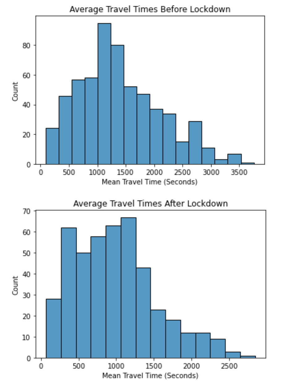
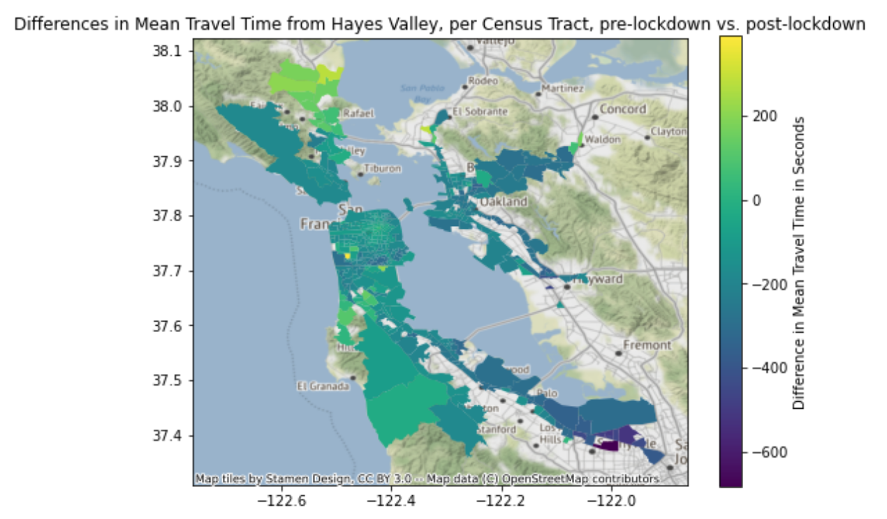
In addition, we noticed that the north most part of the peninsula, around San Rafael, saw the greatest increase in travel time after COVID restrictions were put in place. This was a jarring observation because most of the other areas with data saw little change, hovering around zero difference in travel time (green), or a decrease, especially to areas outside of the immediate metropolitan area (East and South bay). We found it interesting that even though traveling to the Oakland and San Rafael areas both require crossing a bridge over the bay, only San Rafael saw an increase in travel times while the areas nearest to Oakland saw a decrease.
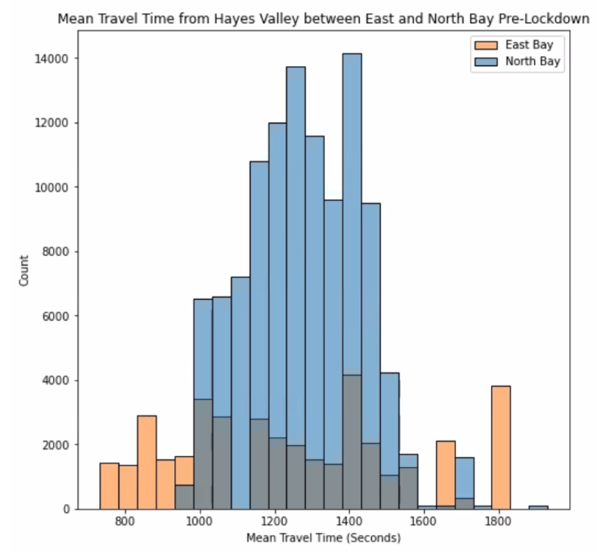
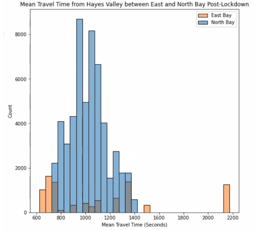
In order to better visualize the travel times from Hayes Valley to either the East or North Bay, we split up the data and created overlaid histograms where one indicates pre-lockdown data and one indicates post-lockdown data, with orange bars being traffic to the East Bay and blue bars being traffic to the North Bay.
Our first observation is that the data of traffic to the East Bay is much more spread out than traffic to the North Bay. In pre-lockdown data, mean North Bay travel times centered around 1200 (20 minutes) or 1300 seconds (22 minutes) while in post-lockdown data, mean North Bay travel times centered around 1000 seconds (17 minutes). As with the heat map visualizations shown prior to the histograms, we see greater differences in the mean travel times for the East Bay post-lockdown compared to the changes in mean travel times for the North Bay post-lockdown. Further analysis into the changes between pre-lockdown and post-lockdown for both East Bay and North Bay will help us better understand the influence of bridges after the COVID-19 restrictions.
Open-ended Questions About the Data
- Why was there a huge increase in travel time near San Rafael? Why #was there a huge decrease in travel time near San Jose?
- How many people live within each census tract, especially in the areas that we’re interested in our experimental design?
- What times of day contributed most to the difference in mean travel time (or lack thereof) between pre and post lockdown?
Problem
Bridges play a key role in the change in travel times from Hayes Valley before and after the COVID-19 restrictions in San Francisco.
To confirm this hypothesis, we plan to split the pre-lockdown data into training and test sets, fit the model on training data, and test it on the test data. We then find the score of this model (S-pre). We will do the same on post-lockdown and then find the score of that model (S-post). We expect S-post > S-pre. If S-post is greater than S-pre by 0.1, then we confirm our hypothesis.
We plan on adding an extra column to our data frame containing whether the destination is in the North Bay or East Bay. This is what our model is trying to predict using the columns in the dataframe (ie ‘Mean Travel Time (Seconds)’, ‘Range - Lower Bound Travel Time (Seconds)’, ‘Range - Upper Bound Travel Time (Seconds)’, ‘speed_mph_mean’, ‘Range Travel Time’). We decided to use all the columns in our dataframe as features because they all seem like they would play a part in predicting locations. In our EDA, we noticed that the changes in mean travel time was higher and lower in some areas, so that might play a significant role in classifying points as North or East Bay. Also, in Step 4, we noticed how average speed went up in post-lockdown compared with pre-lockdown, so we decided to use the “speed_mph_mean” column in our dataframe as a feature.
Modeling: Logistic Regression for Binary Classification
We used a Logistic Regression model to classify locations. It is appropriate because it is used for classification, and we wanted to perform binary classification, with the two classes in our data being North (0) and East (1) Bay. We are interested in these two classes because they are on the other side of the two bridges leading directly out of San Francisco (Golden Gate Bridge leads into North Bay and Bay Bridge leads into East Bay). This is related to our hypothesis, which claims that the bridges affect the travel times out of San Francisco–specifically the Hayes Valley area–enough to cause a difference in how accurate our model is.
To sort and label our data into the two regional groups, we filtered out any destinations in the dataset which fell in the designated bounds for North and East Bay. Using the heat maps generated in Part 3, as well as Google Maps coordinates. Then, using regular expressions (regex), we filtered out straggling data points in San Francisco, Pacifica, and South San Francisco that were captured by the rough latitude and longitude filtering we performed.
We then used a Logistic Regression model to fit on the columns of our data frame and calculated the area under the Receiver Operating Characteristic (ROC) curve for pre-lockdown. We did the same thing for post-lockdown. We expect our model to output regional location (North or East Bay / 0 or 1) based on the input average speed, mean travel time, range of lower bound travel time, range of upper bound travel time, range of overall travel time (upper bound-lower bound).
Model Evaluation and Analysis
Our two models (separated by pre- and post-COVID lockdown) are both binary classifiers, and the resulting model test accuracies were 0.8649 and 0.8600 respectively. This is higher than a baseline random classifier, in which we assume the ratios of North to East Bay data points is a good enough method of classification. We had originally used model accuracy as our metric for seeing how well our model does, but since our data is imbalanced (110,303 compared to 39,805 for pre-lockdown and 54,691 compared to 9,266 for post-lockdown), we opted for the area under the ROC curve instead. Our area under the ROC curve for pre-lockdown and post-lockdown are 0.8537 and 0.7876 respectively. Our model accuracy is very high compared to the area under the ROC curve for the post-lockdown model.
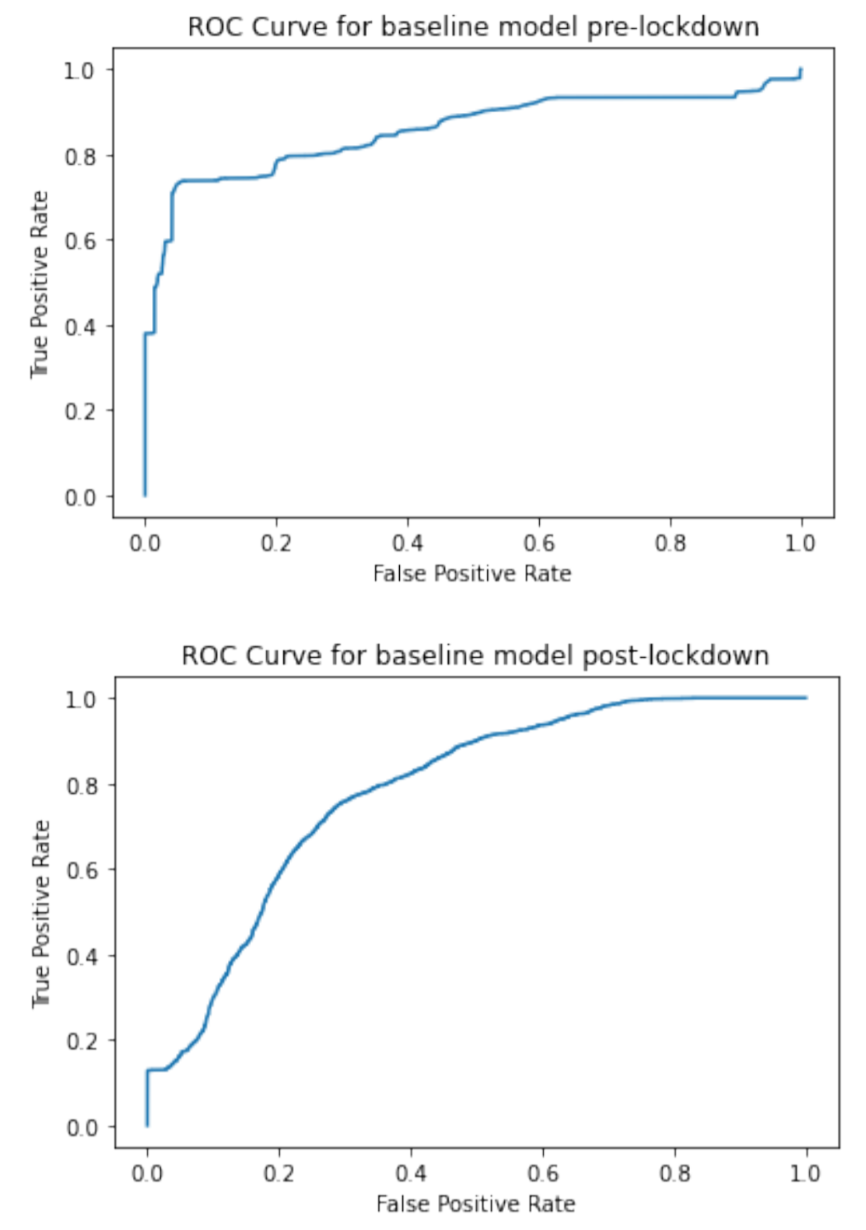
We will look at the area under the curve for the ROC curves (best possible AUC is 1 and worst is 0.5) as a measure of how well our model does at classification. Our AUC for pre and post lockdown baseline models are 0.8537 and 0.7876, respectively. However, the baseline model test accuracies are 0.8649 and 0.8600, respectively. The model accuracy is high compared with the AUC especially for post-lockdown. This is a sign that model accuracy might not be the best metric to use for seeing how well our model classifies locations.
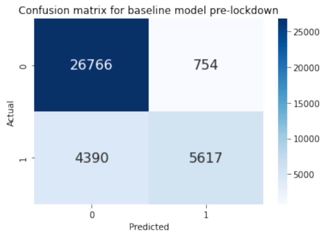
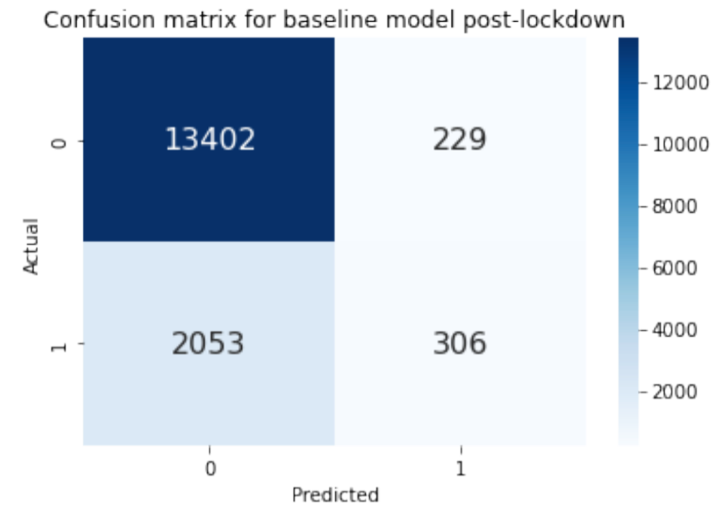
The two confusion matrices above show how accurate our model was at predicting classes. 0 corresponds to North Bay and 1 corresponds to East Bay. Looking at the pre-lockdown confusion matrix, we see that true positive=5617, false positive=754, true negative=26766, and false negative=4390. There are a lot more points that are classified as 0 (North Bay). For the post-lockdown confusion matrix, true positive=306, false positive=229, true negative=13402, and false negative=2053. There are barely any points that are classified as 1 (East Bay).
These two confusion matrices demonstrate how there might be a class imbalance between North and East Bay that’s causing the model to predict North Bay more often. The fact that the baseline model has very little true positives and yet has a high model accuracy tells us that class imbalance might be causing the high model accuracy. Model accuracy might not be the best metric for measuring how well our model is at classifying locations.
Model Improvements
Improvement #1: Fixing Class Weight Imbalance
Out of the original data frame, we sorted the destination IDs into separate North and East Bay dataframes based on latitude and longitude boundaries. In our baseline model, we assigned 0 to all of the North Bay IDs, 1 to all of the East Bay IDs, and fit our logistic regression model to the re-combined data frame containing just North and East Bay data points. We did not set the parameters of the Logistic Regression function to anything other than the default. Later, we realized that there were significantly more North Bay data points than East Bay (110,303 compared to 39,805 for pre-lockdown and 54,691 compared to 9,266 for post-lockdown), which meant that our model was being dominated by North Bay classifiers and rendered a less effective classifier.
To fix this, we implemented the “class_weight” parameter in the Logistic Regression function. It was originally set to “None,” which meant that all classes had equal weights of one. By setting it to “balanced,” the function adjusted the class weights inversely proportional to frequencies in the data so North Bay did not dominate in the model.
By doing this, the area under the ROC curve hovered around the same value as before (0.8537 to 0.8519) for pre-lockdown, but increased from 0.7876 to 0.7960 for post-lockdown. This indicates that the class imbalance was more severe for post-lockdown data than pre-lockdown, which we also observed through the aforementioned North Bay to East Bay data point ratios (~6:1 post-lockdown compared to ~3:1 pre-lockdown). The model accuracy for improvement #1 pre-lockdown and post-lockdown are 0.8794 and 0.7534 respectively. By balancing out the class weights, the model accuracy increased slightly from 0.8649 to 0.8793 pre-lockdown, but decreased greatly 0.8600 to 0.7534 post-lockdown. This signifies that a class imbalance can heavily skew our model accuracy, so if we have a class imbalance, we should probably not use model accuracy to measure how well our model is doing.
Improvement #2: Decreasing Redundancy in Features Chosen From Data Set
When we were looking at the data, we saw that there were two columns labeled, “Range - Lower Bound Travel Time (Seconds)” and “Range - Upper Bound Travel Time (Seconds)”, so we decided to take the difference of those two columns and put it into a new column called, “Range Travel Time”. When we built our baseline model, we included all the columns with numerical values into our X_train, which included all three columns of “Range - Lower Bound Travel Time (Seconds)”, “Range - Upper Bound Travel Time (Seconds)”, and “Range Travel Time”. We realized that since we already have “Range Travel Time”, it would be redundant to have the other two columns, especially since “Range Travel Time” is a linear combination of the other two. These three columns all describe the same aspect of the data, namely the range travel time in seconds, which is a base we already covered with the feature of range travel time. Including the other two columns(“Range - Lower Bound Travel Time (Seconds)”, “Range - Upper Bound Travel Time (Seconds)”) would overfit to specifics of the training data without actually increasing the efficacy of our classification model.
Our solution was to drop the columns: “Range - Lower Bound Travel Time (Seconds)” and “Range - Upper Bound Travel Time (Seconds)”, so that we would just have “Range Travel Time”. This solution is the right thing to do because that way we won’t have redundant features in our X_train and X_test.
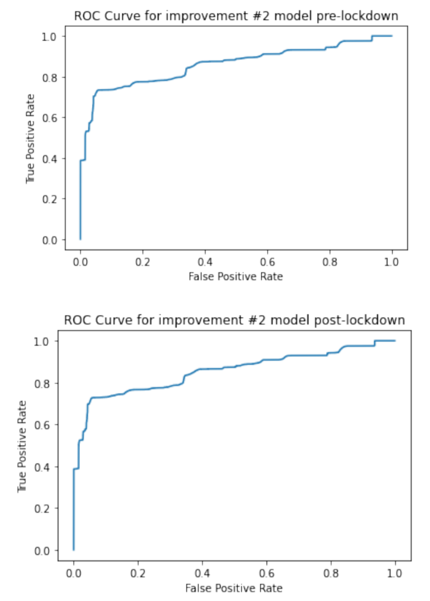
The result was that we ended up increasing the area under the ROC curve from 0.8519 in improvement #1 to 0.8545 for pre-lockdown and from 0.7960 to 0.8606 for post-lockdown. Attached to the right are the ROC curves for pre-lockdown and post-lockdown. Compared to our baseline model’s ROC curves, our ROC curves for our improvement #2 is better (closer to the top left of the graph).
Conclusion
We reject our hypothesis because in our final model (after our improvement 2), S-pre (area under the ROC curve for pre-lockdown) was 0.8545 and S-post (area under the ROC curve for post-lockdown) was 0.8606. S-post is greater than S-pre, but only by 0.0061, which is less than the 0.1 difference we previously set as the criteria.
Future Work
In this project, our guided analysis focused on tackling several questions related to pre-lockdown vs. post-lockdown traffic data. In the open-ended sections, we looked at how bridges played a role in the data by splitting up the data into East and North Bay data points, as well as looking into the effect of weekday vs. weekend traffic data points (in notebook). Further work that we can do is to further contextualize the data based on location. We think that comprehensive work can be done to ask the same questions of locations going away from San Francisco and look into more specific factors like public holidays, tourist destinations, or population density within the city to explain why traffic increased or decreased.
Ultimately, the goal would be to scale up the analysis to apply to different parts of the San Francisco Bay Area and better understand traffic patterns as a whole. A better understanding of the important factors will lead to better choices for features to help model predictions on what traffic speeds or travel times are to be expected given a specific region of the Bay Area. For example, our modeling only covered the effect of bridges on travel time differences between North and East Bay, but it would be interesting to include the South Bay or other bridges (San Rafael, Dumbarton, San Mateo bridges) in future analyses.
This would also help understand adjustments for potential lockdowns in the future as we could remove or add specific features that were less or more important in determining lockdown traffic speeds, respectively. Along the lines of scaling up analysis, local experts in various cities across the country can help in the data analysis of individual cities, such as locating areas of high density during specific timeframes (parks during weekend daytime, downtown during weekend nighttime, etc.) or accounting for large events which would cause extra traffic both on the streets and in the app (concerts, festivals, etc.). As a result, the programmers and the model would both have a better understanding of separate, local factors and yield more accurate predictions for Uber to serve its customer base.